Adding drop shadows to images
Drop shadow world domination
It seems that everywhere you look nowadays, if there's an image or some text, someone has drop shadowed it!. I've used it in a limited fashion on the site, for maps and the diver image on the home page.
I haven't bothered adding a drop shadow to text, as personally I've never seen text rise up from the page to leave a shadow. Well, there was that time at the Glastonbury Festival, but that was chemically enhanced I suspect ![]()
Still, each to his own. If you want to drop shadow text, there's a good tutorial called 'Floating Text (Drop Shadows)' that can be found at Photo Sector.
The drop shadow GIMP script-fu
This is a standard addition to the default GIMP setup. If it isn't in your setup at the location stated below, I've added the drop shadow script-fu to our script-fu database.
Open your image, then apply the GIMP Drop Shadow script-fu, which can be found on the active image at
Filters » Light and Shadow » Drop-Shadow
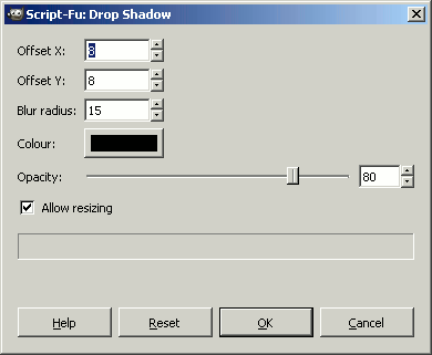
You are now presented with the drop shadow dialogue box, with various options as below

The drop shadow dialogue box variables
1. Offset X and Offset Y This is the drop shadow offset to the photo image. A positive number will shift x right and y down, while a negative number will shift x left and y up.
2. Blur Radius How many pixels the blur will be. This will depend on the size of your image. A small image won't require much of a blur radius.
3. Colour Colour of the drop shadow layer.
4. Opacity Opacity of the drop shadow. 80 is the default, but I've found 60-70 works pretty well. This can be adjusted in the layers dialogue, after you have applied the drop shadow script, so don't worry too much about it now.
5. Allow Resizing This is selected by default and resizes the drop shadow layer to allow for the Blur Radius and X and Y Offset. To be honest, I'm not entirely sure why this is included, as if you don't have it selected the drop shadow sits behind the photo image. Anyway, leave it selected ![]()
Australia dropped
For the demo I've used Australia, as countries surrounded by water look pretty good with this effect I feel. The original image is shown below, before the drop shadow script-fu was applied.

The settings applied were left at the default values shown above, with the exception of Opacity which was set to 70.
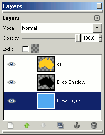
I then added a new layer set to a blue sea colour
Layer » New Layer

Note:
The Layers Dialog can be opened in the active window at
Windows » Dockable Dialogs » Layers
Or keystroke Ctrl L
Merged all the layers
Image » Merge Visible Layers
Or keystroke Ctrl M
And then saved as a gif.

CSS background colours
That's all there is to it. Of course you can save some image size by setting the sea background colour with css. All you need to do is apply a class to the image element and set the following in your css file:
.your_class {
        background: #55aaee;
        }
CSS drop shadows (box-shadows)
It's also possible to create drop shadows, like the one in the text box above, with css. To do this you need to apply a class to the html element and set the following in your css file:
.your_class {
        box-shadow: 6px 6px 5px #444444;
        -moz-box-shadow: 6px 6px 5px #444444;
        -webkit-box-shadow: 6px 6px 5px #444444;
        }
CSS3 will create a drop shadow with the code box-shadow: when it is released, the latest Opera recognises this already.
-moz-box-shadow: can be used for Mozilla based browsers (Firefox etc),
-webkit-box-shadow: can be used for Safari,
Internet Explorer will not implement box-shadow: until version IE9.
In order, the code following box-shadow: means
6px the horizontal offset,
6px the vertical offset,
5px the blur radius of the drop shadow,
#444444 the drop shadow colour.
Adjust the offset and blur radius figures to see how they affect the drop shadow. The offsets can be negative if you wish (-6px).
CSS box-shadow inset
To make the box-shadow: appear inside your html element, all you need to do is add inset between box-shadow: and the reduced offset figures, as shown below.
box-shadow: inset 5px 5px 5px #444444;
-moz-box-shadow: inset 5px 5px 5px #444444;
-webkit-box-shadow: inset 5px 5px 5px #444444;
}
Drop shadow detail
If you want to implement the script-fu manually, there is a more detailed tutorial with screenshots on the next page.
There is also a good example on the Dahab map page of what can be achieved, when implementing the drop shadow and bump map on an image.
